A friend requested a logo for her home quilting business named QuiltDat! (The spelling, I was told, is a Louisiana thing.) No color specified, no style specified.
I like this kind of design challenge – you're basically free to come up with your take on the business name and no pressure for perfection (no time limits, although I think they wanted this quick). The risk, though, is that those who requested it may not like your design. Collaboration is still the best way to design a logo since the ones who will end up using the logo know their business and usually know what they want (or, at least, will have no one else to blame if the design turns out bad since they were in on it).
Here's the logo (no color decisions yet – they like the yellow one over gray, although I meant for this to be like Japanese family crests or kamon/mon, where it's usually white or light colored over a darker colored background):
 It represents a "sunrise" letter 'Q' using quilt patterns.
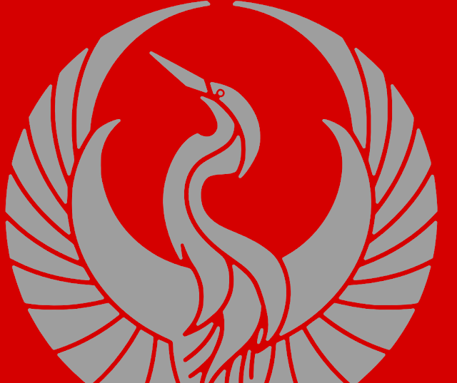
Speaking of kamon, here's another kamon design projectlet I did last month:
And here's the process I took for QuiltDat!:

 It took me a while scrolling down in image searches for 'quilt patterns' (I didn't like the ones with sharp triangles) until I found the Winter Seeds Table Topper at The Crafty Quilter:

I saw it on Google image search but it also appeared on Pinterest. Good thing I selected it before I looked up Pinterest or else I would have gone for a more eye-catching pattern, like the one titled "Rhythmic" in the Pinterest screenshot.
What I like about the "winter seeds" pattern is that it reminds me of the traditional Chinese coin seamless pattern, an auspicious design in Chinese culture:

 Aligning the shapes and lines would be easier if you toggle on most snap-to buttons and then turning them off later once you're done (they could get annoying).

I adjusted the circles' line widths (strokes) until I was satisfied with the proportions of the "winter seed" spaces they made:

I only needed those spaces. In Inkscape, I could have selected all five circles, combined them all (Ctrl+K), converted the strokes to path (Ctrl+Alt+C), broke them apart (Ctrl+Shift+K), selected the four "winter seeds" by Ctrl+clicking each, combined them, and discarded the rest. However, since I want my guides to remain editable, I opted for the quick and rough method: Filling the seed areas with the bucket fill tool (Shift+F7) and using the resulting seed shapes for the next step:
 I first drew a circle in the center of the four seeds formation. The size of the circle was arbitrary – I resized it until it looked good to me.

Then I proceeded to make the tail of the 'Q'
Here's a screenshot of the whole process:


I then tried different orientations of the logotype against the mark (emblem, logo). Here's the finished logo + logotype again:

I could probably try making fillets (rounded corners) or chamfers (lopped off corners) in the design next.Too bad Inkscape doesn't have this function yet (present in most CAD design programs and Affinity Designer), but UPDATE: the Fillet/Chamfer effect is already available in Inkscape 1.0 [this post was based on Inkscape 0.98]
I like this kind of design challenge – you're basically free to come up with your take on the business name and no pressure for perfection (no time limits, although I think they wanted this quick). The risk, though, is that those who requested it may not like your design. Collaboration is still the best way to design a logo since the ones who will end up using the logo know their business and usually know what they want (or, at least, will have no one else to blame if the design turns out bad since they were in on it).
Here's the logo (no color decisions yet – they like the yellow one over gray, although I meant for this to be like Japanese family crests or kamon/mon, where it's usually white or light colored over a darker colored background):
Speaking of kamon, here's another kamon design projectlet I did last month:
Gather visual references
Kids of today are lucky. While I was growing up, we didn't have Google image search or Pinterest.I saw it on Google image search but it also appeared on Pinterest. Good thing I selected it before I looked up Pinterest or else I would have gone for a more eye-catching pattern, like the one titled "Rhythmic" in the Pinterest screenshot.
What I like about the "winter seeds" pattern is that it reminds me of the traditional Chinese coin seamless pattern, an auspicious design in Chinese culture:
Drawing the logo in Inkscape
Using five circles and a couple of lines, I arranged my guides this way:I adjusted the circles' line widths (strokes) until I was satisfied with the proportions of the "winter seed" spaces they made:
I only needed those spaces. In Inkscape, I could have selected all five circles, combined them all (Ctrl+K), converted the strokes to path (Ctrl+Alt+C), broke them apart (Ctrl+Shift+K), selected the four "winter seeds" by Ctrl+clicking each, combined them, and discarded the rest. However, since I want my guides to remain editable, I opted for the quick and rough method: Filling the seed areas with the bucket fill tool (Shift+F7) and using the resulting seed shapes for the next step:
Then I proceeded to make the tail of the 'Q'
Create the 'tail' of the 'Q'
And cut out parts of the "seeds".Here's a screenshot of the whole process:
1. Make the tail of the 'Q'
I used a square whose corners touched the middle and one side of the lower right "seed" to form the tail of the 'Q'. This could have been accomplished by a simple combine command (Ctrl+K) but, since I wanted the tail to be a separate element (so I can experiment with color combinations later) I opted to do a cut out or difference operation on them. I first duplicated the lower right "seed" and its square and did separate difference operations on each of them. In Inkscape, the shape on top cuts out the shape below and then the top shape would disappear (an "A not B" operation). I put the two resulting shapes close together afterwards, allowing for exact placement by turning snapping to nodes on.2. Cut out parts of the other "seeds"
I cut out parts of the other seeds similar to the tailed "seed", then used the flip horizontal (H) and flip vertical (V) tools on them so their cut sides would face the central circle. (If I cut the other three "seeds" from circle-facing side, flipping would have been unnecessary).3. Find the right font to go
I'm not really into logotypes – names come and go while symbols often last longer. But, for the sake of pairing the emblem with the business name, I chose Jasmine UPC Bold Italic. The letters are not too thin nor too fat and they look friendly and the tail of the 'Q' in this font resembles a single stitch or a thorn pricking the bowl of the 'Q'.NexusFont
NexusFont font viewer is very helpful in picking fonts. Plus, if you fire up NexusFont, then view a folder containing your favorite fonts (add the folder first by dragging it to the folder group tree), and then run Inkscape, the fonts you're viewing in NexusFont would be available in Inkscape's font drop-down, even if they're not installed – but you'll need to use Inkscape version 0.48x for this. This functionality has not yet been fixed in the 0.9x series (latest versions).I then tried different orientations of the logotype against the mark (emblem, logo). Here's the finished logo + logotype again:
I could probably try making fillets (rounded corners) or chamfers (lopped off corners) in the design next.
Here's a Youtube video showing how rounded corners can be done in Inkscape (aside from rounding out the sharp inside/outside corners one by one):
")
Also, I could try refining the proportions of each element of the logo using the Golden Ratio (so people trying to reconstruct the logo will have an exact reproduction, kinda like this (another logo design, which I'll probably make a post about):

Lastly, don't think making a logo is often this straightforward. Just like in research papers, stops and starts, false leads, dead-ends and hunches don't make it to the final writeup – but they're very much part of the design process. Here are my discarded ideas:

Have fun with Inkscape!
###https://inkscape.org/en/
Also, I could try refining the proportions of each element of the logo using the Golden Ratio (so people trying to reconstruct the logo will have an exact reproduction, kinda like this (another logo design, which I'll probably make a post about):
Lastly, don't think making a logo is often this straightforward. Just like in research papers, stops and starts, false leads, dead-ends and hunches don't make it to the final writeup – but they're very much part of the design process. Here are my discarded ideas:
Have fun with Inkscape!
###https://inkscape.org/en/
Comments