Two years ago I was assigned to design the website logo of QueenCityCebu.com, a popular Facebook page on all things fun to do in Cebu.
The original Facebook page profile pic is the one below (actual size), and my boss wanted a similar "crowny" feel to the new logo:
I'm a sucker for symbols. Aside from the Sto. Niño, the second most obiquitous symbol for Cebu is the Magellan's Cross shrine/chapel, as can be seen in the Cebu City seal (the pûsô is probably the third):
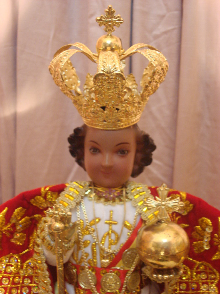
Since I'm lazy, I decided to go via the Magellan's Cross route. I wanted to combine the Magellan's Cross chapel with a shape that recalls one of those bulbous European crowns, like the Spanish royal crown (corona tumular)– which is a bit appropriate, Cebu having been the first major area to be under the Spaniards in their conquest of these islands (and the corona tumular resembles that in some depictions of the Sto. Niño):
 |
| Ellis Manuel Mendez' personal replica at Flickr |
As for the looks, I first wanted the logo to have a simple, line icon, feel like this Pinterest Japan pin, made in 2012 by someone with, coincidentally, the same nickname as mine: Tom:
What I needed was a font ('typeface' for the purist) with the capitals 'O' and 'Q' that felt just right (Google Images is your friend). Baskerville Old Face fit the bill – just the right thick and thin contrast I was looking for (I'm also a sucker for Yin-Yang) and just the right swoosh of the 'Q' "tail". 😉 :
I would modify it and draw a flatter 'Q' frame to contain the Magellan's Cross chapel. Baskerville Old Face will also serve as the logotype's font since there would be two versions: one that fits in a square/circle (emblem) and a wide one (logotype), for the QueenCityCebu website, since the logo placeholder there is in the wide format.
Magelan's Cross chapel is an octagonal building with Chinese influence:
The above picture, from the Cebu Lay Information Center, is especially "Chinese-ey" and I decided to use it as basis for the emblem. Rather than use a cross surmounting the chapel, I decided to focus on the chapel's top's function as a weather vane to tie it up with the Baskerville Old Face-inspired 'Q' frame. Here's what I came up with, in Inkscape, after some ballpen and paper sketching (I lost the notebook last year, unfortunately):
However, as it is, the lines are too thin to survive being turned into a favicon, so I filled up the spaces with Inkscape's bucket fill tool (as I said, I'm lazy). The process is not perfect, but it did create some unintentional gaps that reminds me of the uneven gaps between set stones – I'm also a Wabi-Sabi fan):
The color is like that because the website's WordPress theme has this color scheme (although it would be gold in the Facebook page) ...
Here's the logotype version:
I also made t-shirt mockups (thanks to Irfan Prastiyanto for the GIMP template):
I would later add the *.com for branding. The one below has more outlines for a more classic look:
 |
| I should probably adjust the space between 'city' and 'cebu' ;) |
Then, for this year's Sinulog Festival, we decided to retire the Facebook page's old profile pic and replace it with the new emblem. I just retained the color scheme of the old logo, and put the word 'QUEEN CITY' on an arch to give the phrase more space after Facebook crops the profile pic in a circle. I decided to go for an embossed look (it's just a cosmetic treatment, not integral to the logo). I made several textured versions then we decided to settle for the sand-textured one.
Again, I'm lazy so these were just made in #Inkscape, not a dedicated raster image editor like Photoshop (plus, my PC cannot handle the humongous file sizes and memory hogging of Adobe Products). Cheers ;)


Comments